Monday 25 March 2013

Q6.

Q6. What have you learnt about technologies from the process of constructing this product?


Research and Planning

The first thing I learnt how to do was actually work Blogspot. I had never had a blog of my own before on any of website so had no knowledge whatsoever of how they work. I think the technical aspect of how to use/work the blog was fairly obvious it was more how I would present my ideas that I struggled with as I have never been very creative. However, throughout my planning I learnt many different ways of presenting my work to ensure that my blog looked visually interesting to read. Having done this and gradually gotten better at it I have been able to see a clear different in my work and the layout of my blog has improved dramatically since I first started to post ideas onto it.
 
One of the first posts I uploaded onto my blog consisted of text and a Youtube clip that had embedded onto my blog. This is something that I did not know how to do before. Although it is not a pretty as some of my other posts it allowed me to refer to examples that I have used in my written work. Embedding Youtube videos is a common was of presenting work therefore I feel this was a very useful skill to learn as I have become a lot more digitally literate and therefore may have greater success later on in life as I am aware of how to use such presentational skills showing creativity.

Another way in which I learned how to use present my work was using 'Scribd. This allowed me to upload PowerPoint onto my blog. I found this really useful because power point is something that I have had a lot of experience using so was able to produce a piece of work fairly easily. I did however struggle to upload the PowerPoint onto Scribd at first but after a while I managed to get the hang of it.

My favourite piece of presentation that I found really easily to use was Prezi. It was really easily to throw all my thoughts onto the page and present my ideas in a really creative way. The first Prezi I made was one as a group and this was a very basic Prezi. After a while I was able to explore it further and realised that PowerPoint’s, images etc. could be presented in Prezi. This made it really easy for me to analyse pieces of work as I was able to present videos and images that backed up points I was making etc. One of my proudest pieces of work came from Prezi because it allowed me to be very detailed in my answer but it also looked visually amazing even though it is quite hectic.

 
I found this piece really fun to work on because it meant I could show my create side but also learnt a lot whilst going through it. The good thing I found with Prezi was that there is always something else you can do with it, I was always finding out new things and gaining new ideas through it.

I also found looking at other people blogs to get some inspiration for how I would present my ideas very useful. In particular I looked at Adam Turners blog. I thought that his presentation was fantastic and showed how using a variety of presentation skills could make a blog a lot more interesting.
 
Dafont.com was a website I had never even heard of before doing my research. I thought it was really cool that I was able to search all different types of fonts and define my searches to allow my font to fit in with the genre and themes of my film.
I learned how to download the fonts onto Premiere Pro so to be able to use specific fonts for the titles and credits at the opening of my thriller.

I did however decide against using any of the fonts off this particular website as I found one more suited to my thriller on Premiere Pro. None-the-less I enjoyed learning about the website as it gave me the option to enhance my creativity.


Production
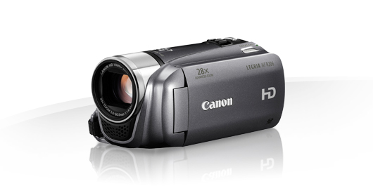

The school provided us with HD Canon Legria cameras. This allowed us to shoot in high definition improving the visual quality of our work.
Before our preliminary task I had not used a video camera at all so my knowledge of it was lacking. However working on my own did work to my advantage in the sense that I was able to teach myself how each device worked so now I can safely say that I know all there is to know about this particular camera!
The camera we used allowed me to zoom in and out which I did find very useful. Because of this my opportunities for creativity were enhanced as I was able to change the focus on screen etc.

We were provided with an SD card by the school where we were to save all of our footage from then camera and transfer it to Premiere Pro. The particular c ards that we were given were very useful for our coursework as they were very fast, small (so we were able to carry them around with us throughout shooting etc.) And waterproof. I
 would say that this was one of our most useful pieces of equipment as it allowed us to mess around with different lengths of shots and re-take shots several time as it provided us with the memory to do so. This gave us the scope we needed to try different things.


Post production

I had never used any kind of filming software before our Preliminary Task so do not have the knowledge to compare Premiere Pro do any other software, however it is extremely professional and gave me the opportunities to play around with my footage as much as I wanted.

The effects of Premiere Pro were very advanced. The colour grading effects in particular was something that I found very useful. It allowed me to turn my footage from a dark location to a bleak, gritty and cold looking location which I found to be key in setting a hostile and deathly atmosphere.
 
Premiere Pro gave me a lot of control over what I was doing so I really felt a sense of achievement at the end knowing that every second of my final cut came from me. The after effects of transitions and the titles allowed me to really develop my creativity and it was the media technology that gave me to option to do so.


Q4.


This advert is raising awareness of how some young girls are treated by boys/men this is a great example of how hard emotive images are quite difficult to watch and as a result discouraging a particular audience (In the case of this advert and my thriller, a male audience is discouraged). 

Girls may also be able to relate to some of the things that happen to Robyn in my thriller which may also be another reason why it is targeted more towards a female audience. 
In most films it is the gender of the protagonist that is then a basis for the gender of the audience. For example, James Bond is targeted more towards men as Bond himself is a male character whom other men will aspire to be and therefore they will make more of an effort to watch the film then females.


Another demographic that will target a particular audience with my thriller is age. Age is a demographic that is fairly obvious in targeting an audience as there are a lot of stereotypes associated with youths.

My thriller targets the ages 16-24 years old. I think this is a suitable age group to target because people around this age are able to identify with specific aspects of my film for example characters, action, themes, location etc. The main characters that are on screen at the beginning of thriller dominating the mise en scene are the three characters Robyn, Craig and Mike. All three of these characters are around this age group therefore people can relate to each of them. 
When thinking about my target demographic of age, I particularly took into account character types and themes of the thriller and what my target age group would like to see. I thought about the types of thriller films and TV programs that this age group may watch and looked into the events and themes represented in them. 
The main events and themes of my thriller are very similar to ones that occur in the film Taken, for example a kidnapping of a young girl by a group looking to use her. Because of this it makes sense to look at the ratings and votes for the film to determine the age range for its target audience. The film accumulated most of its votes from males and females under the age of 18. This gives me a very good idea of the type of thrillers that this particular audience (those 16-24 years old) watch. Because of this I am able to look at events, themes and characters in Taken as a template for finding out the kinds of things that this audience would want to see. 

The girl who is kidnapped in Taken is very young and fragile looking. She is just a healthy normal girl who girls around the ages of 16-24 will be able to identify with. 

In my thriller Robyn is a very normal looking girl who is also very young. I think because of this it is very easy for girls in the audience (of a similar age) to be able to put themselves in her shoes and sympathise with her. This may make them feel some what attached to the character and engage them more in the film provoking necessary emotions throughout. 


There is also however a more mature character in taken which attracts a more mature audience. It shows that the film is not strictly for a younger audience and suggests that people who are older may also like the film. 
Liam Neeson is similar to my character Mike in Deliverer as he is a very morally ambiguous character. This type of character will target an older audience ensuring that age group also is able to identify with a particular character in my thriller. If this was not so, or if Mike and Craig (to two male roles) were a lot younger I think that my age range for my target audience would be a lot more narrow and I do not think that I would of been able to target my thriller any higher than an age of 18 as it would be a thriller consisting of young characters targeting a young audience.


Mike and Craig are the characters in my thriller that balance it out ensuring that it is not a thriller purely for a youthful audience and make it a thriller suitable to target the age rang of 16-24.


Q3.

Q2.

Q2. How does your media product represent particular social groups?


My media product focus' particularly on gender representations in film where men are portrayed as dominant, overpowering and violent towards females and where females are shown to be inferior.

Typically woman in thrillers are portrayed as Femme Fetale characters, extremely tough and independent (a bit like Lucy Liu in every single action film she has appeared in), or they are shown to be weak, vulnerable girls/woman who are used by dominant men. 
In my media product Robyn is represented as a ‘damsel in distress’. The term damsel in distress is taken from classic world literature and usually refers to a beautiful young lady who is placed in a predicament by a villan or monster and requires the help of a hero to save her. This representation has lived through Disney characters like Rapunzel, Sleeping Beauty and even Peach.
However it has over the years been adapted in film and has come to mean a lot more than just a pretty girl who needs saving. In some thrillers we see these woman portrayed as powerless and timid and often stuck in seriously dangerous situations which they cannot find their way out of.
 

Robyn’s character has been caught up in an organisation of gangstas who are using her to do their dirty work. Her character reminds me of Michelle's character in Ill Manors. 
In the film Michelle is a heroin addict who is threatened into prostituting herself to pay off a debt she owes. Although Robyn is not seen to have been exploited or used sexually in the opening of my thriller, the vulnerability and fragility that Michelle carries in Ill Manors inspired my representation of Robyn. 
 
There is a lot of representation of woman being easily manipulated in film recently and stereotypes of these woman having some sort of problem with drugs or money and steering towards prostitution as a way of resolving these problems. I feel that as a stereotype this is something that is overused and a very poor representation so I wanted to move away from the idea that Robyn may be involved with these men in a sexual manor. 
Although I had no desire to force the idea of prostitution on my audience, to develop her character and encourage the audience to sympathise with Robyn, the stereotypical elements were still present in costume, body language and positioning of her character.

For example the shots of Robyn standing on the side of the road are a lot like shots we often see in films where girls are shown to be waiting for a man to drive up next to them. Because of this positioning and the fact a car does drive up next to Robyn, an audience may at first think that Robyn's character is in keeping with the degrading stereotypes that often represent young girls in film . However, I feel these shots add to her vulnerability and create enigma within the scene. 
 
The men in my thrillers are constantly represented as dominant powerful figures. There is the odd film where a woman might have one up on a man at some point but it is very rare that a female character will ever be shown to  be the 'hero'. 


Here is an example of how a woman looks to be powerful, however we are quickly reminded that she is over powered by a man right at the beginning of Sin City.
 
My media product is in keeping with a male dominant representative as I have two strong male characters at the beginning of my thriller both of whom have power over Robyn. Craig throughout the film uses his gender and strength over Robyn in many different ways continuously showing that he is in control. 
 
In this clip of Kill Bill we see The Bride looking timid and vulnerable. This is a scene that inspired a torture scene that look place in my thriller where Craig and his group of cooperatives held Robyn hostage and threaten her to give them information about the organisation she is working for. The representation of men in my thriller are very generic. This is because I wanted to establish the difference in powers and show how vulnerable Robyn is to be caught up in such a dangerous chain of events. 
 
Another stereotype I represent in my thriller is one of age and young girls in particular being very easily manipulated and used. This is something that is present in real life and should be treated carefully in film as it can offend or upset an audience. One film that was able to take the idea of a young girl being kidnapped in such a common way as used is the film 'Taken'. Director Pierre Morel manages to convey the drama and horror through violence and turn such a serious subject into a very gripping thriller film that keeps you on the edge of your seat whilst also provoking empathetic emotions and sending a message to the audience. 
This film largely inspired my plot line. I wanted to make the film less about how Robyn was treated (though if the film was to be developed scenes of her capture would be graphic) and more about why she was taken and the conflict that follows between the rival organisations afterwards.


The filmed that inspired the age representation in my thriller was 'Alpha Dog'. The film is based on a true story where a young boy is held at ransom by a group of men who the young boy's brother owes money to.
 
The boy in Alpha Dog is shown to be easily manipulated and vulnerable to the group of men that have taken him as ransom throughout the film. What Robyn and his character in Alpha Dog have in common is having been caught up in some dodgy dealings and suffering the consequences of someone else's actions. I continued with this generic stereotype of young children being used and incapable of looking after themselves as it meant the audience could easily feel sorry for Robyn, but it also added to drama and hard hitting realisation that things like this do actually happen and children do get dragged into such dealings.

Q1.

Final Cute of Deliverer


Here is my final cut of Deliverer.

Tuesday 19 March 2013

Q7.

Q7. Looking back at your preliminary task, what do you feel you have learnt in the progression from it to the full product?

Since my preliminary task I feel I have gotten a better understanding of mise on scene and what is needed in film to convey conventions such as location, character type etc, to tell a well-rounded, realistic story. Our preliminary task lacked in plot, character type and did not fit into a particular genre or represent a theme.

Because of this I was able to see how without challenging conventions it was difficult to present a story that was gripping and relevant to a genre. 

When doing our thriller research we looked at what directors seek to establish in the opening of thrillers. By doing this it meant that I could take knowledge from my preliminary task and elaborate on aspects that were weak within it to hopefully convey ‘location, character types, themes and storyline/plot’ that reflected thriller conventions. 


Comments from my preliminary task showed that the steadiness of the camera used was weak. Since this I have learned how to use a tripod to steady shots. The tripod was used often in the filming of my thriller, especially when I was shooting longer, more enigmatic shots because it meant that without it I would need a steady hand for a long period of time.

One other comment was that the smoothness of editing was also weak. The preliminary task was the first time I had used Premiere pro so did not have knowledge on how the software worked. However, by doing this task prior to editing my thriller I was able to play around with the software and ensure that for my final piece I knew how it worked and how I could adapt and edit footage to make it look smoother, cleaner and to convey conventions of a thriller (for example, using Premiere Pro to play around with the lighting in my shots to make the location/setting seem more cold and bleak).

 
During the preliminary task we learned how to shoot a conversation and how to shoot people walking. The rule that stuck in my mind after this was the 180° rule. I learned that largely this rule is followed as without it shots can look messy and may also confuse consumers. Though some filmmakers like Stanley Kubrick purposely break this rule to show disorientation. When filming my thriller I decided that breaking the rule was not necessary for the opening. Although in my thriller we see Robyn kidnapped, I felt it enabled the audience to visually connect with the scene better without confusing the picture. Instead I decided to use the sounds of -Robyn’s actor Ellie- screaming to represent discombobulation.